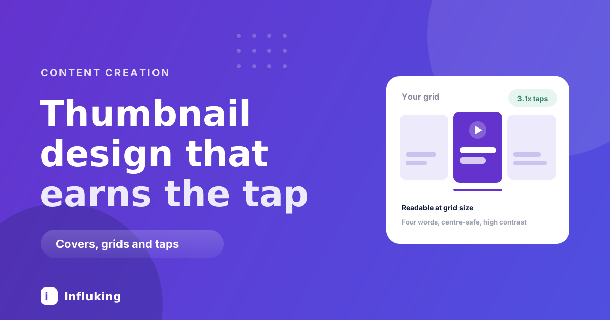
A thumbnail is judged at about the size of a postage stamp, on a phone, by someone moving fast. Almost every design mistake comes from making it on a laptop at full size and never checking what survives the shrink.
On Instagram the cover has a second job that people forget. It appears in the feed for a moment, then it lives in your grid permanently, which means it has to work as a tap target now and as part of a wall later.
The one test that matters
Export it, put it on your phone, and look at it from arm's length. If you cannot read it in under a second, it fails, regardless of how good it looks on a monitor.
That single check catches most problems: text too small, too many words, low contrast, a busy background, a face too far from the camera. Do it before you publish rather than discovering it in the grid afterwards.
Four words maximum
The most common failure is treating the cover as a place for a sentence. Nobody reads a sentence at thumbnail size, so a long line becomes a grey smudge and the design does nothing.
Two to four words is the working range. The cover is not there to explain the video, it is there to make someone want the video explained. "Why your rice sticks" beats "The three reasons your rice keeps coming out sticky and how to fix it".
If the phrase will not compress, that is usually a sign the video is about too many things.
Contrast does the work
Legibility at small sizes is almost entirely about contrast, not about font choice.
- Put text on a solid block. A shape behind the words guarantees contrast regardless of what the footage is doing. It is the least fashionable technique and the most reliable one.
- Use a heavy weight. Thin fonts vanish when scaled down. Bold or extra bold survives.
- Avoid text over busy footage. Detail behind letters destroys the edges that make them readable.
- Skip drop shadows as a fix. A shadow is a patch over a contrast problem. Solve the contrast instead.
The grid crops your cover
This catches nearly everyone. A Reel cover is vertical, but the grid shows it as a square crop taken from the middle. Anything you placed near the top or bottom gets cut off in the grid even though it looked fine in the feed.
Keep the text and the face inside the central square. Instagram lets you choose the grid crop separately when you set the cover, and it is worth using rather than accepting the default.
The same principle appears in the profile checklist, because the grid is the first thing a visitor from a Reel actually looks at.
Faces, and where to look
A face with a clear expression outperforms a static object in most niches, because a person reads as a person even at tiny sizes. The expression has to be legible, which means larger and more exaggerated than feels comfortable.
Eyes matter more than the rest. A face looking into the lens creates a connection that a face looking away does not, and a face at an angle with the eyes visible reads better than a straight-on shot with the eyes half closed.
If your niche does not suit faces, the fallback is a single object filling the frame, not a wide shot of a scene.
Design for the wall, not just the tap
Your grid is a portfolio, and a stranger who liked one Reel scrolls it before deciding to follow. Nine covers that share a treatment read as a body of work. Nine that share nothing read as a scrapbook.
- Pick one text position and keep it. Same place, every cover.
- Pick two fonts and stop. One for the main line, one for anything secondary.
- Use a limited palette. Two or three colours you reuse. This is what makes a grid look designed rather than decorated.
- Keep the same crop logic. If your face is always left and text always right, the wall gets a rhythm.
Building this as a reusable template takes twenty minutes once, which the Canva guide covers.
Picking a frame from the video
Instagram lets you scrub to a frame or upload a custom image. Uploading gives you full control, but choosing a frame is faster and often fine if you shoot with it in mind.
The trick is to film one deliberate frame for the cover: hold a clear expression, hold the object up, stay still for a second. A frame grabbed mid-sentence usually catches you mid-blink with your mouth open, which is why so many auto-selected covers look bad.
Thumbnails elsewhere
If you are also posting to YouTube Shorts or long-form, the rules shift slightly. Shorts thumbnails are small and often skipped entirely in the feed, so the first frame of the video matters more than the cover image. Long-form YouTube is the opposite, where the thumbnail is most of the click decision and higher contrast and bigger faces are the norm.
Do not reuse one image across all of them without checking. Aspect ratios and crops differ, which is part of the wider cross-posting problem.
Mistakes worth fixing today
- A sentence instead of a phrase. The single biggest one.
- Text near the edges. Cropped in the grid, hidden behind the interface in the feed.
- Different look on every post. Costs you the grid entirely.
- Text that repeats the hook word for word. Wasted. Let the cover ask and the video answer.
- Judging it on a laptop. You are designing for a fingernail-sized version you never looked at.
- Changing covers on old posts constantly. Fine occasionally, but it is rarely where the problem is.
How to tell if it is working
Reach tells you whether the algorithm distributed the video. It does not isolate the cover, since most Reel views come from autoplay in the feed rather than from a tap.
The place the cover genuinely matters is your profile. Compare how many people land on your profile with how many go on to watch something, and if that gap is wide, the grid is not selling. Fix the covers before you make more content, because it improves every post you already published, which is the same logic as the profile work in raising engagement.